3 Sets of Doors Had to Go to Make Room for This Pink Galley Kitchen
Brass trim and mirrors equal Parisian vibes.
Updated Oct 11, 2018 5:12 PM
We may earn revenue from the products available on this page and participate in affiliate programs.
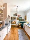
In order to make way for her vision of a Paris-inspired kitchen, Charlotte, North Carolina–based design blogger Natalie Papier, ironically, had to get rid of three sets of French doors. Among the many other awkward features standing in her way: a skinny central island and a sink facing a mirror. “It felt so boxed in,” recalls Papier. “It lacked the airy quality that the rest of the home had.” Switching to a galley floor plan immediately opened up the formerly chopped-up room, and starting with a fresh canvas allowed her to channel vintage vibes through Art Deco–inspired lighting, mirrored glass panels, and an old-school banquette.
In addition to gutting the old cabinetry (the only thing Papier saved during the demolition was the refrigerator), she closed up the threshold that once led to the patio. This allowed her to extend the new marble countertop across the room and situate the sink in front of a window overlooking the lush backyard. To add to the complexity of the redesign, Papier was calling the shots from Chicago, where she and her family lived up until this winter. “At one point, I flew down here with six big boards painted with blush swatches,” she says of hunting for the perfect cabinetry color. The winning hue—Malted Milk by Sherwin-Williams, a not-too-Barbie-or-bubblegum shade of pink—set the tone for the bold makeover, filled with bright renovation ideas.
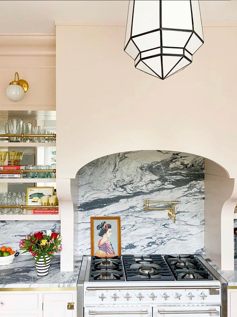
Accentuate the Countertops
Drawing on classic café design, Papier decided to wrap the pearl gray marble countertops in brass trim. The only catch was that the metal laminate couldn’t be attached directly to the stone. “I wanted to be able to see the rounded edge of the marble,” she says. “And I also didn’t want it to follow the top line of the lower cabinets.” After mulling over the execution, she decided to put down a faux countertop surface made of thin plywood first, that way the lining would have something to adhere to. Then came the splurge-worthy stone, which is all the more stunning thanks to the shiny border.
Elevate Open Shelves
Another idea inspired by Paris restaurant culture: brass bars. Papier lined the open shelves with them to spice up the ordinary planks (it also provides a nice barrier for precious glassware). She kept the theme going by adding mirrors to the backs of the openings and hanging classic globe wall sconces.
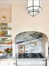
Carve Out a Statement Hood
In an effort to combat the room’s boxy shape, Papier began bringing in elements with soft edges, like the arch above the stove. At first she thought about constructing the hood out of plaster or drywall, but that was a no-go once she and her contractor realized they’d need to keep access to the vent open in case of an emergency. Papier tasked the same crew who constructed the faux countertop with building the structure out of two wood pieces that can be taken apart when needed.
Opt for Old-School Seating
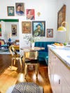
Sourced from an estate sale in Chicago, the mid-century modern banquette, once covered in a “stained-up, sticky orange vinyl,” is now swathed in a wipe-able (read: kid-friendly) faux leather. To complete the booth area, Papier devised a gallery wall made up of portraits, starting with the blue-toned man now positioned underneath the sconce. “We call him Jacques-Pierre,” says Papier. “He looked a little lonely up there by himself at first, but now he has plenty of friends to hang out with.”


Introducing Domino’s new podcast, Design Time, where we explore spaces with meaning. Each week, join editor-in-chief Jessica Romm Perez along with talented creatives and designers from our community to explore how to create a home that tells your story. Listen now and subscribe for new episodes every Thursday.