Go Bold (and Beautiful) With the Best Black Paints for Kitchen Cabinets
Designers depend on these eight shades.
Updated Oct 12, 2018 2:58 AM
We may earn revenue from the products available on this page and participate in affiliate programs.
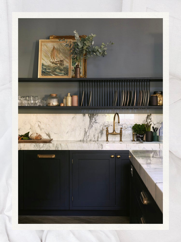
Dramatic. Dominant. Dark. The descriptors most commonly associated with black paint can be a little over the top, but the hue is more approachable than you might think. And while painting an accent wall in this color (let alone an entire room) may seem like a risk—it is a statement, after all—believe it or not, black can have a cozy and inviting effect when applied correctly.
In fact, most of our favorite moody kitchens feature black in different applications. Designers love the color for its warmth and richness, especially when paired with bright whites or romantic blush pinks for dramatic flair. The right paint choice can take your kitchen cabinets from drab to sophisticated, and these are the eight shades the pros depend on to create contrast.
- Best overall: Farrow & Ball Off-Black
- Best balance: Clare Blackest
- Best depth: Portola Whitney Portal
- Best cool: Farrow & Ball Railings
- Best warm: Portola Story Teller
- Best classic: Farrow & Ball Pitch Black
- Best drama: Benjamin Moore Jet Black
- Best neutral: Sherwin-Williams Tricorn Black
A Few Things to Keep in Mind
Kitchen design: Unlike white paint, which is a natural reflector of light, black absorbs rays from the sun and glow from can lights, which means it looks best in window-bathed spaces. “I think black looks great in small kitchens with an open floor plan,” notes Miami-based designer Brittany Farinas of House of One. “It helps define the space and can become a focal point, while adding drama and visual interest.”
Warm and cool undertones: “Black paint acts as an intensifier to any and all tones that are put next to it,” adds Farinas. “Since it is such a high-contrast color, it can make cool tones seem cooler and warm tones a lot more vibrant.” Because of this, Lauren Svenstrup of Sven Studio always recommends testing your choice before fully committing to a color. “There are so many shades and variations of black tones, so a matte and satin finish, even in the exact same color, can be dramatically different,” she warns.
Finish: A sticking point the pros vary on is what kind of finish to use. Allison Crawford, founder of Hotelette, says a flat finish looks especially eye-catching against crisp white walls. But New York designer Cara Woodhouse prefers something shinier. “I like to use the color on both the trim and the walls, but I’d use a full-gloss sheen on the millwork and Farrow & Ball’s Estate Emulsion finish (it only has a 2 percent sheen) for everything else,” she says. Word to the wise: Matte finishes are best for low-traffic areas, as they’re more likely to show scuff marks and fingerprints.
Our Top Picks
Best Overall: Farrow & Ball Off-Black
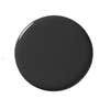
This chalky option was the clear winner of the group (multiple designers said it’s their go-to pick). “In certain lighting, it reads as dark gray,” Dee Murphy of Murphy Design points out. Because of that, she adds, it’s the perfect introduction to the “dark side.”
Best Balance: Clare Blackest
All of Clare’s products are zero-VOC, meaning they’re formulated without the carbon-based solvents found in most other brands. “It’s a no-brainer,” says Natalie Myers of Veneer Designs. She describes this intense black as not too watery and not too thick, making it a great option for DIYers who want a stress-free application.
Best Depth: Portola Whitney Portal
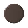
This nontraditional choice ticks “depth” off of ETC.etera designer Sally Breer’s checklist every time. “It’s not a black hole that feels hollow; there are some warm brown-red undertones in it that make it really dynamic,” she says.
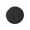
Best Cool: Farrow & Ball Railings
Unlike its more beloved counterpart, Off-Black, this swatch from Farrow & Ball skews bluer. Although the color gets its name from ironwork, “it doesn’t feel sterile,” says designer Heidi Callier. To really bring out the navy undertones, the brand suggests using the full-gloss version.
Best Warm: Portola Story Teller
Designers tend to shy away from blacks that look too purple, says Tamara Kaye-Hoye of House of Honey, but this one strikes the right balance between a warm violet and rich charcoal. “We use a limewash in most of our projects,” she adds, noting that the old-world treatment “envelops a room in the best way.”
Best Drama: Benjamin Moore Jet Black
WeWork’s creative director of design strategy, Rubén Hernández-Correa, thinks a lot about using paint to highlight the architectural character of a building. His go-to choice for doing so is this straightforward shade. The same goes for Svenstrup. “Our go-to paint brand has always been Benjamin Moore,” she adds. “We tend to go with a satin finish for black kitchen cabinets. [It] is cleanable and durable without being over-the-top shiny.”
Best Classic: Farrow & Ball Pitch Black
Woodwork, flat walls, siding—designer Jason Arnold loves this pure, velvety option so much he went so far as to paint the entire exterior of his house with it. “It’s the perfect classic because it goes with everything,” he says. There’s nothing to fear here.
Best Neutral: Sherwin-Williams Tricorn Black
Farinas relies on this inky shade of black to add visual interest. “I love using Tricorn Black because it’s a neutral black that has a lack of undertones, so it’s perfect for almost any application,” she says. “There’s no hidden sheen that pops through, which makes it a great base for a variety of cabinets, walls, and beyond. Its ability to create unique and moody moments makes it my absolute favorite.”
Ask Domino
Do I need primer for black paint?
Primer is largely dependent on the material and state of your kitchen cabinets—you’ll always want it for wood, but sometimes melamine coatings are sticky enough for paint to grip onto. “If the cabinets are stained, use an oil-based stain-blocking primer, which seals knots and other surface defects that might bleed through the top coats,” Decorist designer Aurielle Jones advises. “If the cabinets have a sheen to them, you can either sand them down or use an abrasive pad dipped in a liquid de-glosser before priming.” Another tip: Tint the primer with your black of choice to help reduce the number of coats needed (and save a few extra bucks).
How much paint do I need for kitchen cabinets?
When asked to determine the exact amount of paint needed to cover kitchen cabinets, Decorist designer Casey Hardin recommends multiplying the length and height of your cabinets to get the total square footage, then dividing that number by the paint’s promised coverage (typically 400 square feet). If you have a significant amount of millwork, add an extra 10 percent to be safe.
How We Vetted These Products
Every product in a Domino guide meets these criteria:
- They blend form and function. We believe the best-designed products reflect your personal style and are a joy to use.
- They’re expert approved. In addition to our team of editors, we tap a range of designers, makers, renovators, and all-around knowledgeable people to share their intel.
- They’re endorsed by people who actually own them. We pay close attention to real reviews to know that they pass the test IRL.